

Bento Box Design Template: How to Build a Clean, Modern Bento Grid Layout
If you've ever wrapped up a great project and then spent the entire evening wrestling with how to present it, a bento box design template is about to become your new favorite shortcut. This guide walks you through planning, building, and exporting a reusable bento grid layout that works for websites, Instagram, Pinterest, and portfolio presentations.
Key Takeaways
-
A bento box design template is a pre-built layout of mixed-size tiles inspired by Japanese bento lunch boxes. Apple's iPhone 14 product pages (2022–2024) popularized this pattern across the tech and design world, and it has since become a go-to structure for SaaS pages, portfolios, and social media graphics.
-
This article shows you, step by step, how to plan your content first, map it into a bento grid with clear hierarchy, and then build a reusable template in tools like Figma or Canva.
-
Bento layouts work best for modular content - features, benefits, stats, screenshots - and can quickly elevate presentations, e-commerce homepages, and case studies without advanced design skills.
-
You'll get concrete layout patterns (2×3, 3×3 bento grids), spacing suggestions (16–24 px gaps, 16–24 px corner radii), and export tips for Instagram (1080×1350), Pinterest (1000×1500), and web banners.
-
The article ends with an FAQ covering responsiveness, accessibility, tile counts, and when a bento layout is the wrong choice for your content.
What Is a Bento Box Design Template (and When Should You Use One)?
A bento box design template is a pre-built layout made of tiles of different sizes, arranged within a consistent grid. It's inspired by Japanese bento lunch boxes - compartments that organize different kinds of food into one compact, visually appealing container. In design, each compartment holds one piece of content: a logo, a stat, a screenshot, a headline, or a product photo.
The pattern went mainstream when Apple used it on its iPhone 14 product pages in 2022. Those pages showcased camera quality, chip performance, battery life, and privacy features in asymmetric rounded tiles with strong visual hierarchy and a restrained color palette. The design went viral. By 2023 and 2024, brands like Notion, Linear, Vercel, and Framer had adopted bento layouts for their landing pages and feature overviews.

Bento grid vs. standard grid
A standard grid uses uniform tiles - same width, same height, repeated in rows. A bento grid deliberately mixes large hero tiles, medium supporting tiles, and small accent tiles to create focus. This bento box layout displays content in distinct boxes, each self-contained with one clear job: a headline plus 1–2 lines of copy, one strong visual or stat. You can rearrange individual tiles without breaking the overall design.
The layout maximizes space with organized information, which is why the layout helps users find information quickly - especially on pages with many features or products to present at once.
When bento layouts work well
-
SaaS and product pages. Feature-overview sections that need to summarize multiple capabilities in a single hero area. Bento grids suit businesses with distinct ideas to showcase.
-
Dashboards and data summaries. When you need to display several KPIs or stats at a glance, tiles with large numbers and minimal copy read faster than paragraphs.
-
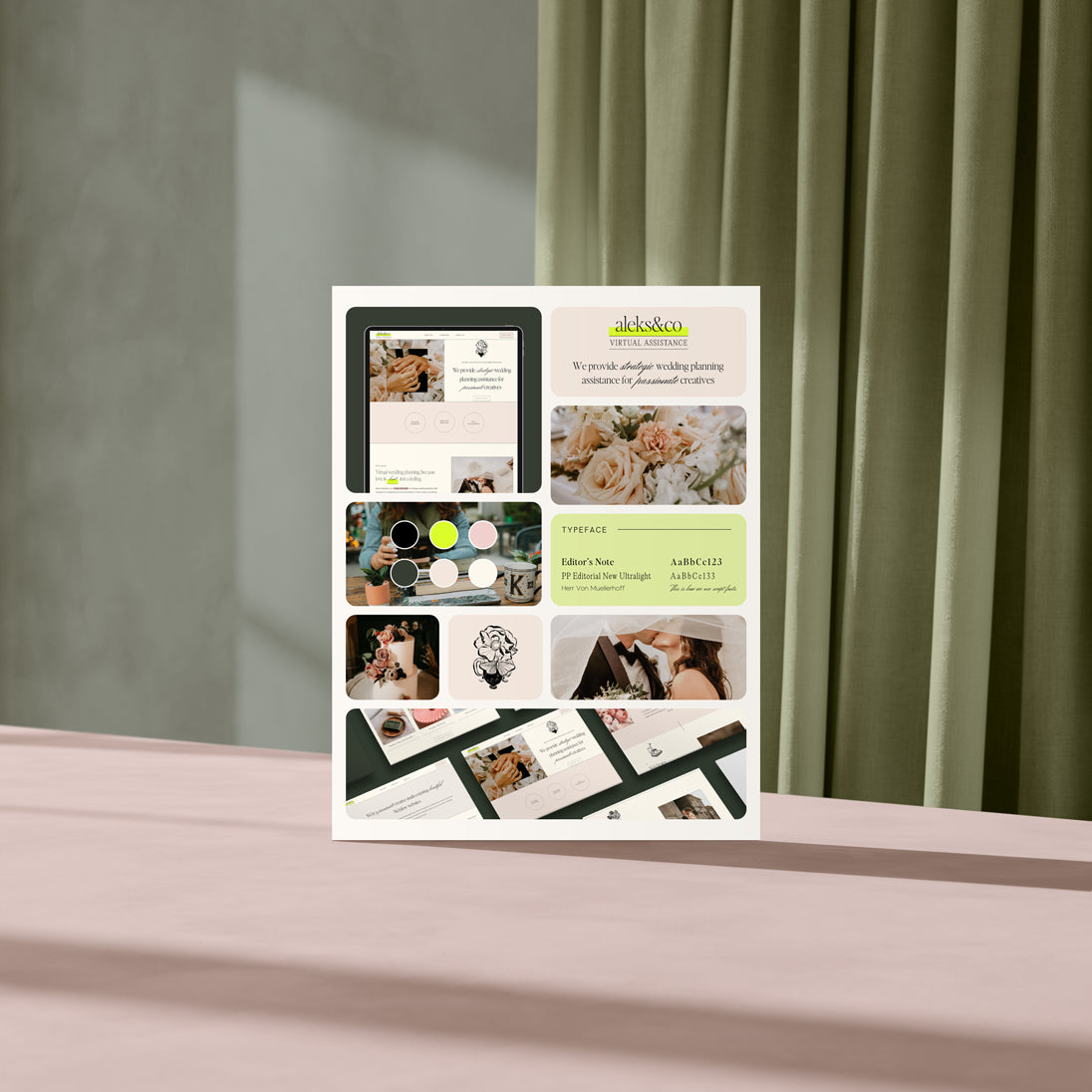
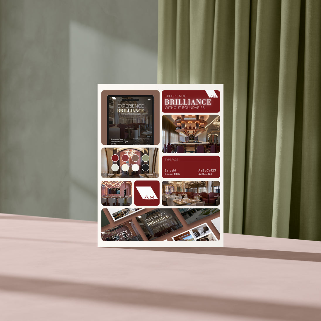
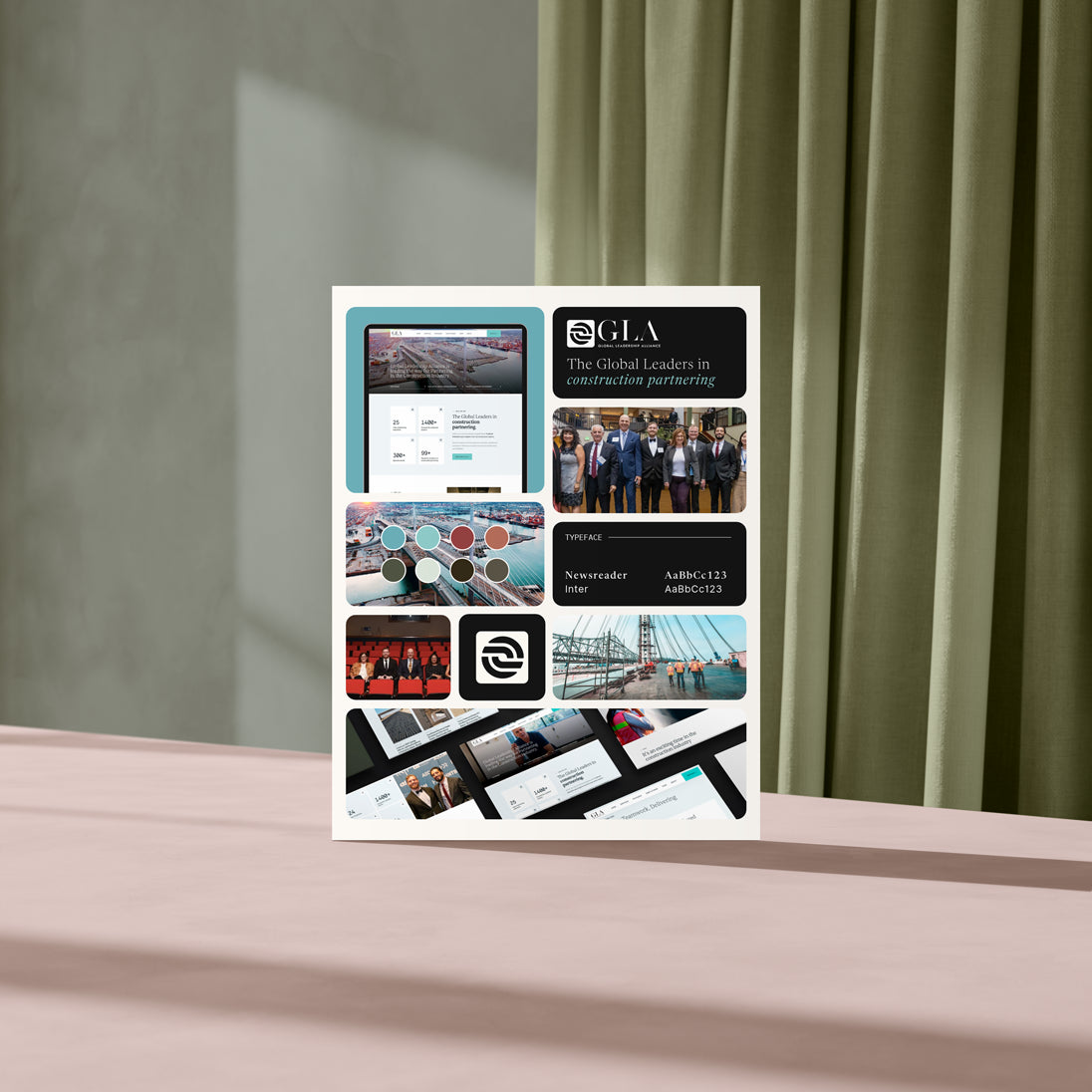
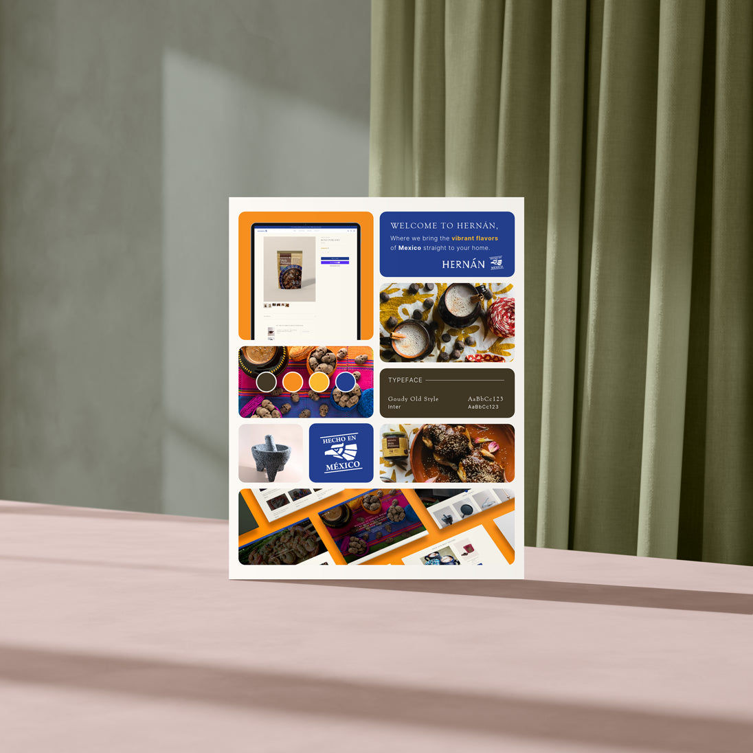
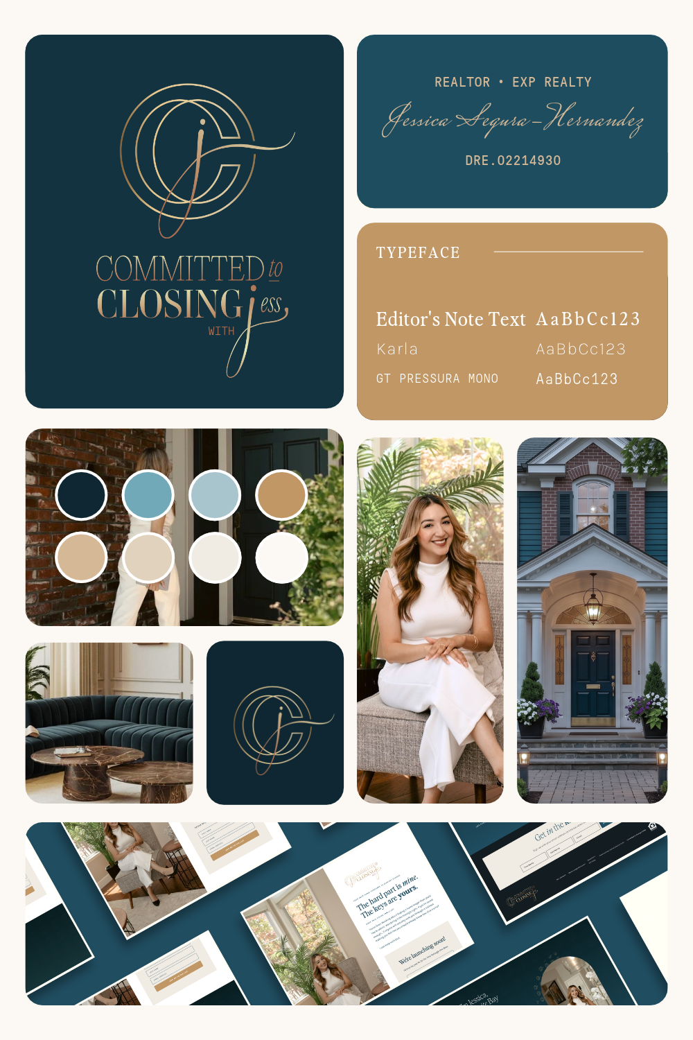
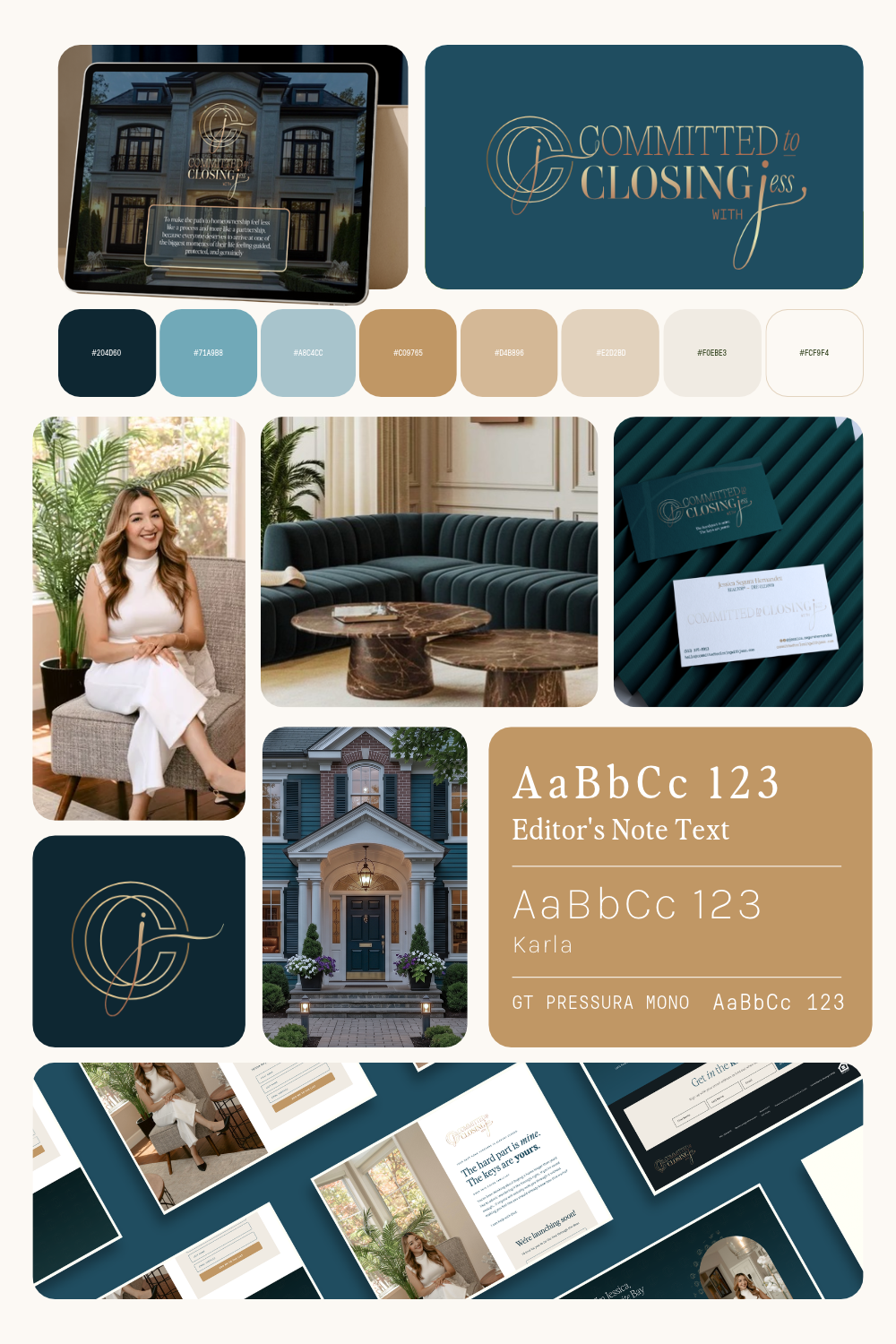
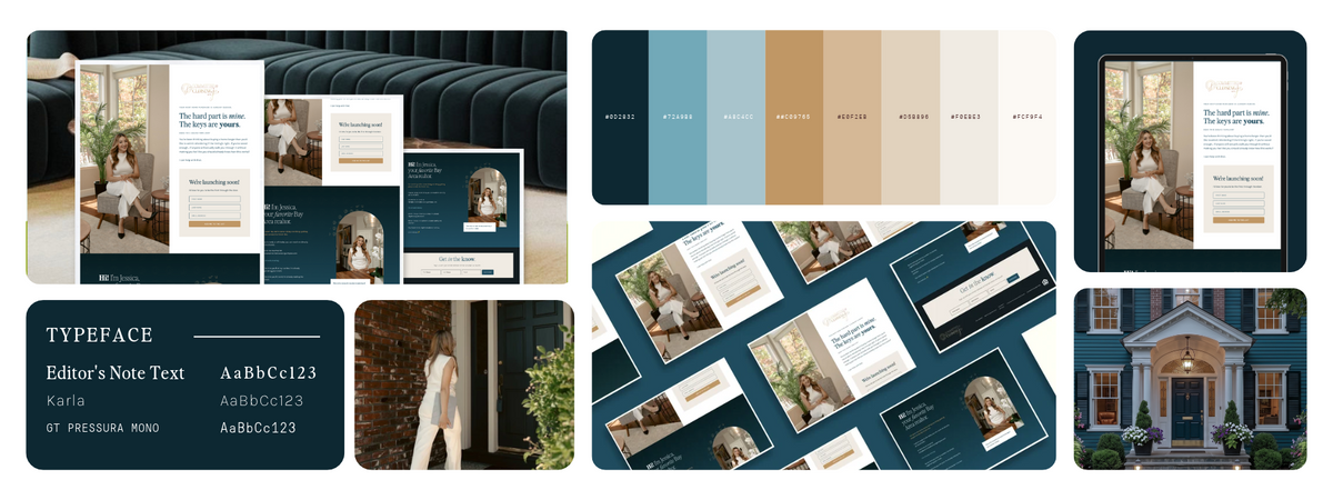
Portfolio and case study summaries. One tile per brand element - logo, color palette, typography, mockup - so a whole project is visible in one frame.
-
Social media graphics. Instagram carousels, Pinterest pins, and one-slide project overviews. Many graphic design inspiration galleries feature bento grids prominently.
-
E-commerce websites. Bento layouts are effective for e-commerce websites where you need to highlight product categories, bestsellers, or seasonal collections without overwhelming the page.
In traditional Japanese bento culture, the Kyaraben style allows for creative and playful lunch preparations appealing to children - proving that the bento concept has always been about making content (or food) both functional and visually engaging.
When a bento layout is the wrong choice
-
Long-form content that requires linear reading (articles, documentation, tutorials).
-
Dense comparison or pricing tables where column alignment matters more than visual tiles.
-
Multi-step processes like forms, wizards, or onboarding flows that demand sequential progression.
-
When your visual assets are sparse, inconsistent, or don't map into self-contained pieces - forcing bento in that case makes the grid look patchy.

Planning a High‑Impact Bento Layout (Content First, Grid Second)
Strong bento layouts start with content planning, not dragging boxes on a canvas. The grid should serve your material, not the other way around. Decide what each tile must communicate before you worry about sizes or spacing.
Gather your assets first
Before you open any design tool, collect everything into a single folder:
-
Logo assets. The main logo, plus any icon or submark.
-
Hex color codes. The exact codes for every brand color, written down and ready.
-
Typography choices. Font names for headings, body, and any accent typeface. Make sure fonts are installed and available in your tool - a missing font is the quickest way to make a grid look unfinished.
-
Screenshots. 3–6 key screenshots of your website, app, or product. Full-page and section screenshots both work.
-
Product photos. 2–4 images that share the same lighting and mood.
-
Benefit statements. 3–6 short claims like "99.9% uptime" or "Trusted by 5,000+ teams."
Fifteen minutes of organizing assets saves hours of fixing later. This prep is what makes the rest fast.

Map content into tile roles
Once your assets are ready, assign each one a tile type:
|
Tile Type |
Purpose |
Example Content |
|---|---|---|
|
Large (hero) |
Flagship message or visual |
Main product screenshot, headline like "Built for speed" |
|
Medium (2–3 per grid) |
Core benefits or product visuals |
Feature demo, key photo, benefit statement |
|
Small (2–4 per grid) |
Stats, badges, icons |
"50K+ users," star rating, security badge |
Think of it like packing a physical bento box: packing large sturdy foods first prevents damage to delicate items during transportation. The same principle applies - place your biggest, most important elements first, then fill in around them. Use mini leak-proof containers to keep wet ingredients separate from dry foods; in design terms, keep different content types (photos vs. stats vs. copy) in their own tiles rather than cramming them together.
Choose a grid pattern
Select from these common bento grid patterns:
-
2×3 layout. One large hero tile plus five equally sized supporting tiles. Clean, balanced, easy to fill.
-
3×3 asymmetrical. One tall hero tile spanning two rows on the left, with smaller tiles filling the remaining space. Creates strong visual hierarchy.
-
Asymmetrical mix. Two large tiles stacked on one side with a mosaic of smaller tiles on the opposite side.
For a good balance, use 5–9 tiles total. Fewer than 5 often feels too simple; more than 9 can become visually busy unless you're designing a data-dense dashboard.
Visual hierarchy and copy rules
-
The biggest tile hosts your strongest message. Supporting tiles must not compete visually.
-
Each tile has one job. If you can't summarize the tile's purpose in five words, it's doing too much.
-
Copy length per tile: one headline (up to ~40–50 characters), an optional subline of 1–2 sentences, and one primary visual element. Cramming long paragraphs into tiles breaks the clarity that makes bento grids work.
Mixing different textures ensures a more interesting bento meal, and the same applies to your grid: alternate between photo tiles, stat tiles, and icon tiles to keep the eye engaged.
Brand consistency
-
Limit tile backgrounds to 2–3 brand colors. More colors don't make it richer - they make it messy.
-
Keep typography styles limited: one heading style, one body style.
-
Reuse icon style throughout so the bento box feels cohesive rather than patchwork.
The traditional bento 5-color rule includes red, yellow, green, white, and black or dark brown in every bento box. In design, this translates to using a balanced, intentional palette rather than grabbing random colors. Use contrasting colors to achieve visual rhythm in your bento presentations - never place two tiles of the same background color next to each other for better visual separation.
The 4:3:2:1 ratio from physical bento preparation - 4 parts carbohydrates, 3 parts protein, 2 parts vegetables, and 1 part sweet treat - offers a useful mental model for content distribution: roughly 4 tiles of core information, 3 of supporting visuals, 2 of social proof, and 1 accent or CTA tile.
Responsiveness planning
Responsive design is crucial for bento box layouts. Think about how a three-column bento layout will collapse into one or two columns on mobile. Decide which tiles should stack first so the hierarchy still makes sense - your hero tile should always appear at the top, followed by medium tiles, then small ones. CSS Grid's template-areas property makes this manageable in code without reordering content semantically.
Step‑by‑Step: Building a Reusable Bento Box Template in Your Design Tool
These steps are tool-agnostic but written so they make sense in Figma, Canva, or similar tools. The goal is to end with a reusable master template you can drop new projects into - so your energy goes into the project itself, not rebuilding a layout every time.

Step 1: Set up your artboard
Create your base frame at the right size for your output:
|
Format |
Dimensions |
Use Case |
|---|---|---|
|
Web hero section |
1440 × 900 px |
Landing pages, homepages |
|
Instagram post |
1080 × 1350 px |
Feed posts, carousels |
|
Pinterest pin |
1000 × 1500 px |
Pins, idea boards |
|
Website banner (wide) |
1920 × 800 px |
Full-width hero banners |
If you're building for multiple platforms, create a separate artboard page for each size. The underlying tile relationships stay the same - only the canvas dimensions change.
Step 2: Set your colors
Start with the color palette. Swap each swatch to match the project's hex codes before doing anything else. When every other box can pull from the same palette, the whole grid stays cohesive with almost no extra effort.
A shallow container showcases food nicely without letting items sink - think of your tile backgrounds the same way. Use light tonal shifts (not heavy borders or drop shadows) to differentiate tiles. Common approaches from design systems include near-white canvases (#fafafa) for light mode and near-black grounds (#0b0b0f) for dark variants, with accent color reserved for interactive elements only.
Step 3: Build the grid structure
Choose a column system and set consistent gaps:
-
Columns. A 12-column grid works for most desktop bento layouts. Tiles snap to column boundaries so spacing looks intentional.
-
Gutters / gaps. Use 12–16 px gaps for tighter layouts; 16–24 px for spacious hero sections. Keep gaps uniform across all tiles.
In Canva, use frames to create your tile structure. In Figma, use Auto Layout or manual frames with consistent spacing values. The key is that every gap matches - food should be kept from shifting during transit using snug packing or dividers, and your tiles should feel just as locked-in.
Step 4: Draw and size your tiles
Here's how to distribute tile sizes across your grid:
-
Hero tile. Spans 8 columns wide × 2 rows tall on desktop. This is your flagship content - the main screenshot, headline, or product visual.
-
Medium tiles. Span 4 columns each. Use these for secondary features, product photos, or benefit statements.
-
Small tiles. Span 2–3 columns. Stats, badges, icons, or single-line claims fit here.
Explore different arrangements until the visual weight feels balanced. The hero tile should draw the eye first, then medium tiles, then small ones.
Step 5: Convert tiles to reusable components
In Figma, convert each tile into a component. In Canva, use frames so images and screenshots can be dropped in and auto-cropped without rebuilding layout. This is what makes the template reusable - your only job for the next project is to swap in new assets.
Step 6: Style your tiles
-
Corner radius. Set to 16–24 px for a soft, modern feel. Use consistent values across all tiles - mixing radii is one of the most common mistakes. If small tiles look overly rounded, reduce to 8–12 px for those.
-
Background colors. Pull from your brand palette. Visual appeal can be enhanced by mixing shapes and contrasting textures, but keep the palette limited.
-
Shadows. Use very subtly or not at all. Premium bento grids rely on tonal contrast, not heavy shadows.
Decorative details like seaweed shapes enhance the visual appeal of physical bento boxes; in your design, the equivalent is subtle icon work, small illustrations, or gradient accents that add personality without competing with the content.
Step 7: Place content inside tiles
-
Position headlines at the top left of each tile.
-
Keep icons and stats aligned with text using consistent internal padding (24–32 px on all sides).
-
Use sans-serif typefaces - Inter, Geist, or SF Pro are popular choices. Headline text in large tiles around 20–24 px bold; supporting copy 14–16 px lighter weight; stats in dramatic tiles can go 48–72 px for impact.
Balancing color, portion ratios, and tight packing keeps food fresh and appetizing in a physical bento box. The same principle applies to your tiles: every element should fit snugly, with consistent padding, so the grid reads as one unified piece rather than scattered fragments.
Step 8: Check alignment and spacing
Zoom out and look at the whole grid. Run through this quick checklist:
-
Are the gaps between all tiles even?
-
Do the colors feel balanced across the layout?
-
Is anything cut off or awkwardly cropped?
-
Do tile backgrounds avoid placing two of the same color next to each other?
For web and app usage specifically:
-
Test at common breakpoints: 1440 px, 1024 px, 768 px, and 390 px.
-
Verify that tap targets are at least 44 × 44 px on mobile.
-
Check hover or interaction states for clickable tiles.
Cool all food before sealing a bento box to prevent moisture buildup - in design, the equivalent is stepping away for a few minutes before your final review. Fresh eyes catch misalignment that you'll miss after an hour of pixel-pushing.
Step 9: Export and post
-
PNG for social media - text stays sharp, colors stay accurate.
-
JPG or WebP for websites - smaller file size, faster page loads.
-
For design systems, save your bento box template as a master component or template page dated clearly (e.g., "Bento Grid Template – Updated 2026-11-21").
Sizes to remember: 1080 × 1350 for Instagram, 1000 × 1500 for Pinterest, and your chosen width for web banners.
Common build mistakes to avoid
-
Misaligned gaps. Some tiles shifted off-grid by a pixel or two. It's subtle but it makes the whole layout feel sloppy.
-
Inconsistent corner radii. Mixing 16 px and 24 px radii on the same grid creates visual friction.
-
Clashing imagery. If some photos are bright and flat while others are dark and dramatic, the grid loses cohesion. Select images that share the same lighting and mood.
-
Overcrowding small tiles. Not every box needs to be full. Some breathing room is what makes it elegant.
-
Using bento just because it's trendy. If your content doesn't map to self-contained tiles, choose a different layout. The pattern has seen saturation since 2023, and many designers note that without a unique touch or brand-specific customization, bento grids can feel templated.
Frequently Asked Questions
Is a bento box layout only for Apple‑style product pages?
Not at all. While the bento grid became widely recognized from Apple product pages (especially around 2022–2024), it's a flexible pattern. It works for SaaS dashboards, analytics summaries, portfolios, newsletters, e-commerce websites, and even slide decks - anywhere content can be split into self-contained tiles. The key is whether your information naturally breaks into discrete, modular pieces.
How many tiles should I use in a single bento grid?
A practical range is 4–9 tiles for most use cases. Use 4–5 tiles for a simple feature highlight, 6 tiles for a balanced 2×3 layout, and up to 9 for a detailed overview. Beyond 9 tiles, the grid often feels busy and hard to read unless you're building a data-dense dashboard where users expect density.
Can I use the same bento box template for both web and social media?
Yes. The underlying structure - the relationships between large, medium, and small tiles - can be reused across formats. Adjust the artboard dimensions to fit each platform: 16:9 for web banners, 4:5 (1080 × 1350) for Instagram, and 2:3 (1000 × 1500) for Pinterest. Keep tile proportions consistent and the design will translate well in just a few clicks.
What if my content doesn't fit neatly into bento tiles?
If your content needs long-form explanation, detailed comparison tables, or complex forms, a traditional layout (stacked sections, columns) will serve you better. Reserve the bento grid for summaries, highlights, and overviews - place it at the top of a page or between longer sections as a visual break. Trying to force dense, interconnected content into tiles reduces clarity instead of improving it.
Do I need advanced design skills to create a good bento grid?
No. Basic familiarity with a visual design tool is enough. By starting from a template, using consistent spacing, and limiting your colors and fonts, non-designers - marketers, founders, product managers - can build polished, on-brand bento layouts. The secret isn't design talent; it's preparation. When your logo, colors, fonts, and photos all belong together, the grid looks professional with minimal effort. That's what makes bento templates so easy to work with, even if design isn't your day job.